最近相对比较有空闲,打开博客界面,看来看去总感觉主界面太“平”了,一打开就一个头像几行字,周边全是空白区域,有种很单调的样子,看不下去了,打算做一个自己的主页。
Homepage主页
首先看一下修改后的效果,如下: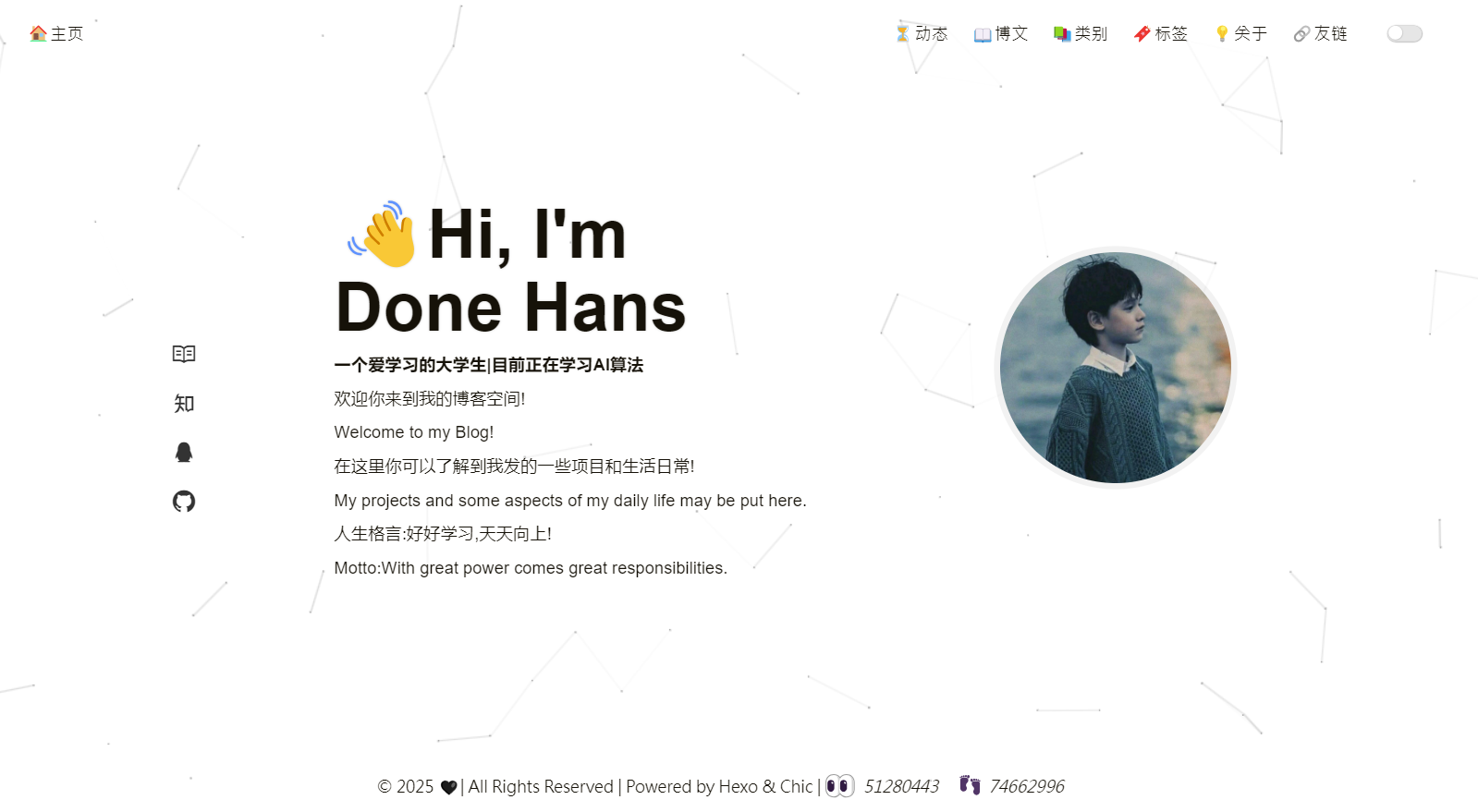
手机端页面效果: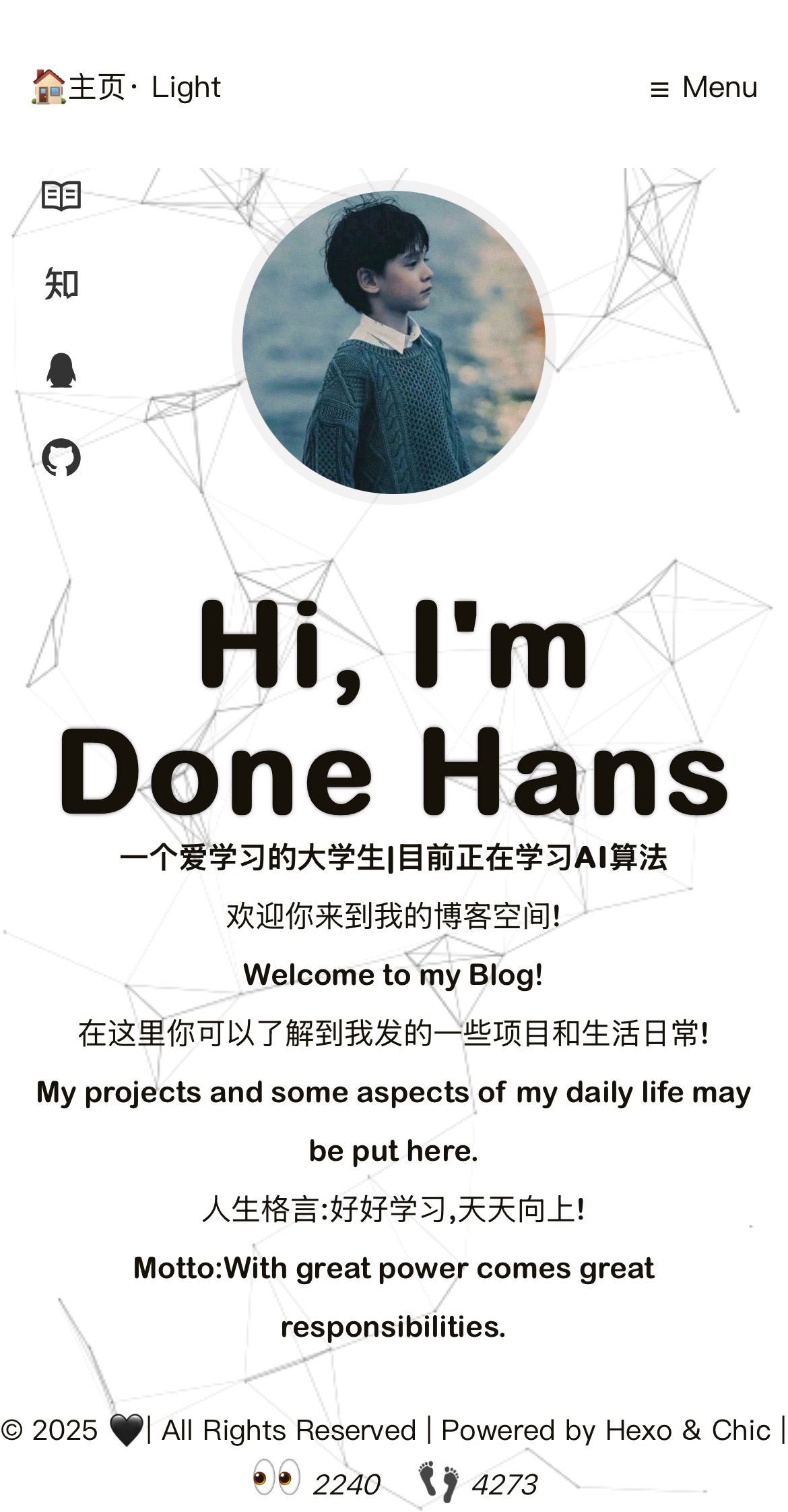
主页的想法
当然这次改变不想改变Chic主题作者的初心,“简约”,一开始想不到什么样子既简约又看起来不单调,在网上找来找去,终于在b站刷到一款自己相对比较称心的简约风格主页
OK,这就是我要做的主页模板了!
ejs文件的修改
要改变原本的布局,首先要对原有的组件进行添加或者修改,找到原版的主页文件夹,按照文件路径themes\Chic\layout\_page打开,找到profile.ejs文件,没错了,这就是主页的布局文件,下面是我修改后的ejs文件,各位可以进行参考
1 | <link rel="stylesheet" href="../fonts/iconfont3/iconfont.css"> |
代码相比原有的代码其实基本没有什么改变,主要是加了Hi,I'm这几个字,另外,在这一步有需要比较注意的点是,头像的布局要在content的上面,原因是在手机端布局的时候,头像要布局在content的上面,不然渲染不出来(这一步我踩坑了好久)
styl文件的修改
进入/Chic/source/css/_page文件夹,找到profile.styl文件,在文件渲染代码上,我借助GPT,告诉GPT我的需求:我希望link链接出现在左边竖直排列,然后横向分布文字描述,接着是头像/或者其他东西。巴拉巴拉,经过很久的调整,终于给我生成了下面的代码:
1 | /** Profile **/ |
在上面的代码中,我还考虑了夜间模式和响应式网页分布(手机端和平板端布局),具体的就不说多了,感兴趣的可以研究一下。
对了完成以上这个步骤后,就完成了!(如果是我们新建的styl文件和ejs文件,我们还需要把他们对应起来,具体可以看《基于HEXO中的Chic主题友链的添加》这篇文章)
(如有错误和不好的地方,请多担待,另外对程序有问题请提出噢!)